Restaurant Design

As restaurateurs well know, the dining experience is about so much more than the quality of the food. Depending upon the circumstances, dining out can be a fun escape, a decadent luxury, a cozy gathering of friends, a chance to see and be seen, a special celebration…or, if necessary, it can be a quick stop to refuel on your way to the next thing on your schedule. Whatever the occasion and your motivations for dining out, they are very much taken into account by the people who design restaurants, and their work has a strong effect on us – whether we are aware of it or not.
Prior to the current “restaurants as theatre” era, an eatery’s decoration tended to conform to a pattern – most taverns, for instance, were male enclaves and looked pretty much alike (dim lighting, dark colors, lots of wood and mirrors, liquor advertisements, gilt-framed paintings of scantily-clad women, etc.). At the other end of the spectrum, restaurants that catered to women (such as tea rooms) were lighter and airier – pastel-hued walls, delicate chairs and tables, flowers, and other traditionally feminine ephemera that paired perfectly with the cuisine (dainty tea sandwiches, cakes, etc.). Any variations to the décor in these establishments, such as murals, usually reflected the personal taste of its owner or owners. For the most part, though, the design of a restaurant was not meant to call attention to itself, and (especially in the case of taverns), ambiance was not considered much of a priority.
How times have changed! Now, a restaurant’s cuisine and its physical design are inextricably tied together – all the elements (the lighting, the music, the layout, the linens, the menus, the waitstaff attire, even the restrooms) are integrated and meant to make the diner’s experience a unique, pleasurable, and memorable one. And one of the most basic, and perhaps subliminal, ways this is accomplished is through a restaurant’s use of color. How? Here’s a general rundown:
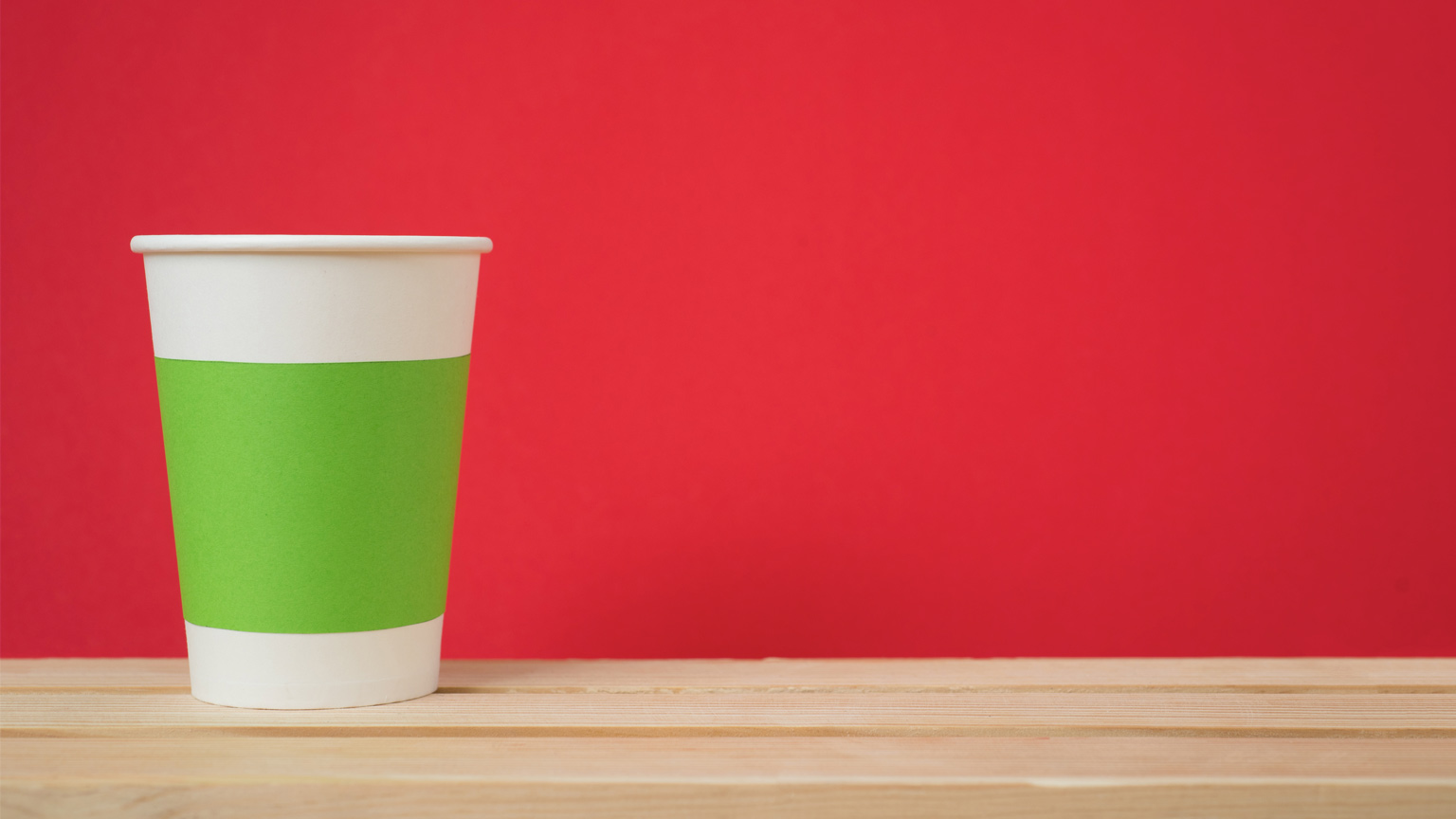
Red – If you operate a fast food restaurant and want a quick turnover of customers, paint your walls red. The color has been shown to cause a spike in heart rate and blood pressure in patrons, and is likely to spur them to eat more food more quickly. The brighter the hue, the more they’ll want to hurry and move on. If that isn’t the effect you’re going for, try using red as an accent color instead.
Orange and Yellow – Mellower shades of these colors (pumpkin, soft coral, butter) are terrific for restaurants – they give a cozy, cheerful vibe (again, the brighter the hue, the less inviting the venue). Orange and yellow are particularly good for breakfast spots, as they mimic the feeling of a sunny morning and complement the fruit juice and egg dishes on the menu.
Green – This color signifies good health, freshness, and the great outdoors, and of course, is also a color we strongly associate with vegetables. So, it’s a great choice for an eatery catering to vegetarians, organic food fans, and anyone wanting a balanced, nutritious meal in a place with a relaxed vibe. Combined with earthy browns and copper hues, green creates a comfortable, mellow environment where you might want to stay awhile.
Blue and Purple – With the exception of eateries that have a nautical theme (or contain an actual fish tank!), blue is not a popular hue for restaurants for several reasons. Subliminally, it tends to make you feel thirsty rather than hungry (great for drink sales, but not so much for food volume), and the reflection of the color onto the food can make it look unappealing (blue food, for the most part, is an appetite killer). Purple has a similar effect – it is better used as an accent color, or better yet, in a more offbeat venue such as a hookah bar.
White – This color (or non-color) can make a room look bigger and is therefore great for small venues – white (and its close cousins ecru, cream, and beige) is also a good neutral for banquet halls and other places where big events are held and you want the focus elsewhere. It’s best combined with some colorful accents, to avoid a sterile, “hospital” feel.
Black – If you are determined to use black as a wall color for your eatery, this is a situation where you can combine it with bright accent colors – against this palette, they will really stand out! Black is a good option only if you don’t mind a room looking smaller and (much) darker. Or if you are dying to display your large collection of kitschy blacklight art. Otherwise, you might want to use this color sparingly.
Want to hear more about restaurant design from a local expert? Check out David Manilow’s Chat, Please! conversation with Chicago-based restaurant (and Check, Please! set!!) designer Karen Herold.


